
Local Authority (LA) Health Profile reports that accompany the online tool have now been refreshed for 2018.
These reports are intended to act as conversation starters, providing a summary picture of health in the local area, highlighting areas of improvement and those needing further attention.
This blog will go through the different sections of the LA Health Profile reports and how they should be interpreted.
Local authority summary
The first page of the report provides a narrative summary of the health outcomes in a local area. This highlights the key health messages relating to the locality, which are generated from the data presented later in the report.
Population
The population pyramid on page 2 illustrates the age profile of an area. This is important as areas with different age profiles will have different service requirements. The figure below shows an example of this - the age profiles for Peterborough alongside West Dorset. Peterborough has a much younger population and therefore will have different health needs from the older population in West Dorset.
The population projections for 2020 provide an estimate of how the population in the area is expected to change over the next few years.
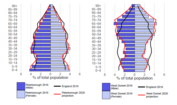
Population pyramids for Peterborough (left) and West Dorset (right)
The report also specifies what proportion of the population is under 18, aged 65 or over, and is from an ethnic minority group. Different population groups require and interact with services differently and understanding both the age and ethnic profile of a locality can help inform possible reasons for differences in health outcomes, and enable more appropriate provision of resources.
Deprivation
Grouping areas into quintiles according to the level of deprivation within a larger geography is a way of identifying localities that are in greater need of services. Deprivation covers a broad range of issues and refers to unmet needs caused by a lack of resources of all kinds, not just financial.
To assign national deprivation scores, the country is split into small geographical areas called Lower Super Output Areas (LSOAs). These LSOAs are then ranked according to the Index of Multiple Deprivation - an overall measure of multiple deprivation experienced by people living in an area.
These ranked LSOAs are split into five equal groups, or ‘quintiles’. The most deprived areas in England are assigned to quintile one and appear darker in the maps used on page 2 of the LA Health Profiles reports. The least deprived areas in England are assigned to quintile five - the lightest shade of green in the map.
The bar chart beside the national quintile map illustrates the proportion of the population in a locality that live in areas at each level of deprivation, and how this compares to England.
As a new feature this year, a second map that depicts local deprivation quintiles has also been included in the report. This map is slightly different from the national deprivation map in that LSOAs are assigned to a quintile based on their ranking within the chosen local authority, rather than according to their ranking nationally.
This is helpful in illustrating the distribution of deprivation relative to the local area. In local authorities where most LSOAs are assigned to the same national deprivation quintile, the local deprivation map helps to further distinguish the variation in deprivation.
We’ve used Purbeck as an example below, where most of the population are assigned to quintiles three and four when using the national ranking. Using local quintiles helps to better identify the areas in greatest need.
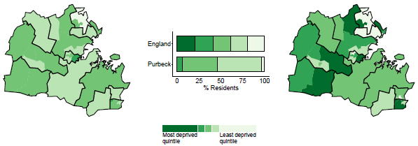
National (left) and local (right) deprivation maps for Purbeck
Health inequalities
Although life expectancy has increased over time, inequalities remain in how long different groups of people are living across the country. Males living in the least deprived communities live 9.3 years longer than those in the most deprived, the gap is 7.3 years for females.
On page 3, you’ll find charts which show the variation in life expectancy across the ten local deprivation deciles for the chosen local authority. Deprivation deciles are calculated in a similar way to deprivation quintiles but LSOAs are split into ten categories instead of five. The estimated life expectancy for each deprivation decile is plotted and the Slope Index of Inequality (SII) acts as a line of best fit.
The steepness of the slope represents the inequality in life expectancy that is related to deprivation in the local area. The steeper the slope is, the greater the inequality. If there was no inequality in life expectancy the line would be horizontal. It is worth noting that a flat line could also be the result of a more uniform population in which there is little variation in deprivation across an area.
Stockton-on-Tees has the greatest SII for both males and females - for males there is a 14.9 year gap in life expectancy between the most and least deprived groups, for females this gap is 13.9 years.
In West Oxfordshire on the other hand, the SII gradient is almost horizontal. This indicates that regardless of the local deprivation decile a resident is assigned to, they would be expected to live to a similar age. As you can see in Stockton-on-Tees, residents in the most deprived group have a reduced life expectancy.
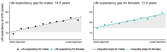
Slope Index of Inequality, Stockton-on-Tees, Males and Females
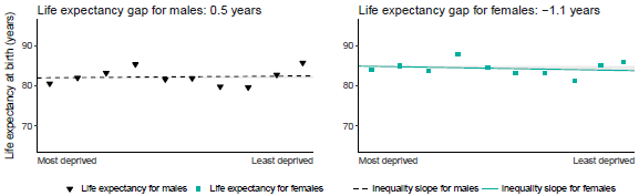
Slope Index of Inequality, West Oxfordshire, Males and Females
Trends in premature mortality
Charts showing the trends in premature death rates for the local area, and how these compare to England can be found on page 3. For the overall premature mortality charts, trends are also plotted for the people living in the most and least deprived quintiles locally. This grey shaded area on the chart illustrates how the inequality gap in premature mortality has changed over time.
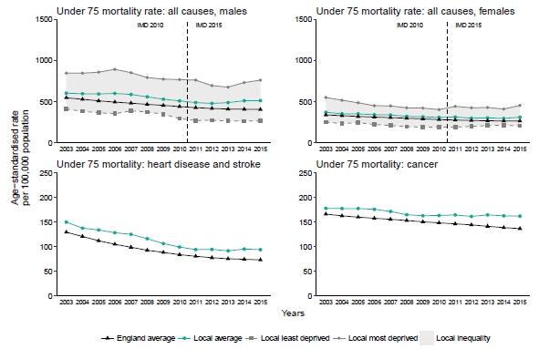
Trends in premature mortality, Walsall
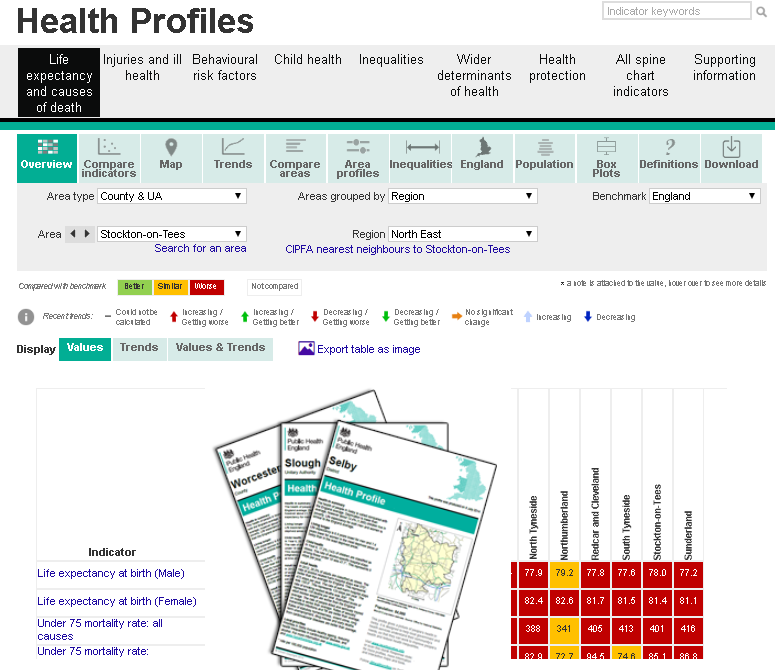
Spine Chart
On page 4, the spine chart shows the LA Health Profiles report shows a local area’s value against 32 health-related indicators (Indicator units are specified at the bottom of the page). These indicators have been organised into categories that reflect the chapters of the Health Profile for England so that it is easy to find local data for the key national trends identified.
Each indicator value is coloured according to how it compares to England, for example, a red circle means that this area is significantly worse for a given indicator.
The grey bar indicates the range of results for all areas in England and the diamond shows the regional average. This provides a visual comparison as to where the local area sits compared to other localities.
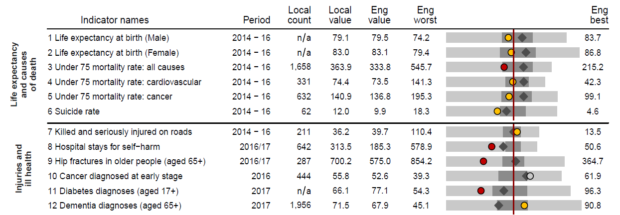
2018 Spine chart, Bournemouth
Data in the page 4 spine chart are correct as of July 2018. If more up to date data are required the LA Health Profiles online tool is updated on a more regular basis.
We value your feedback – if you have comments on our reports, data tools or have ideas that you would like us to consider, please get in touch via the comments below or email us at healthprofiles@phe.gov.uk.
1 comment
Comment by Melusi posted on
Over the past few years there has been a noticeable improvement in the way PHE present their reports - with the end user in mind.
A GP once said to me that PHE produced lots of colourful charts that did not help them much, but this seems to be changing.
It is good to see this effort to help users to understand the reports better.
Well done!