
This Q&A blog introduces ‘GBD Compare England” a new data visualisation tool created as part of the Global Burden of Disease project. PHE’s Chief Knowledge Officer John Newton has blogged about the findings of this major piece of research and you can also refer to an accompanying Lancet paper: Changes in health in England with analysis by English region and areas of deprivation: findings of the Global Burden of Disease Study 2013.
What is GBD Compare?
It’s a new online tool that for the first time enables you to rank the burden of disease for 306 conditions from 1990-2013 by region and deprivation, along with the relative impact of 79 different risk factors. All data is specifically for England and ‘burden’ of disease is measured by Disability Adjusted Life Years (DALYs) that place values on the years of life lost to disease and the years of life lived with disability as a result of disease, and combines the two.
Who is the tool aimed at?
The tool is open access however it was developed for a predominantly professional audience. The complexity of the information available, and the terminology used, means it is most suited to data analysts specialising in public health or healthcare, healthcare professionals and researchers or academics.
How do we expect the tool to be used?
One answer to this question is “over to you”. We hope that people coming to the tool are hoping for and finding new insight on how disease affects people in England, though of course many may simply take a general look to get to grips with the functionality. There are some caveats and issues we want to be clear about from the outset:
- GBD Compare should be seen as one tool in a professional’s armoury, not the only tool. It complements, not replaces, tools like PHE’s Fingertips/Profiles tool. For instance, Fingertips uses published data sources whereas the GBD tool uses modelled data. So when using the tool, be clear about what question you want to address and the other sources of information that might inform you. GBD Compare may help to confirm what you believed to be the case, or present something completely new.
- The new tool is created by IHME, the organisation behind the wider Global Burden of Disease project. We have had more input than ever before into the data, and the tool which visualises it, as we want it to provide maximum benefit for professionals in England. The more we can promote and improve the tool, the higher the uptake will be and the more we’ll learn for future iterations. We therefore present the tool as a work in progress rather than the finished article.
- Like any new tool we want to know whether users would value further guidance or training.
What metrics are available?
Mortality and morbidity are measured using;
- Deaths by cause
- Years of life lost (YLL) - Premature mortality/death
- Years lived with disability (YLD) – Premature morbidity
- Disability-adjusted life years (DALY)
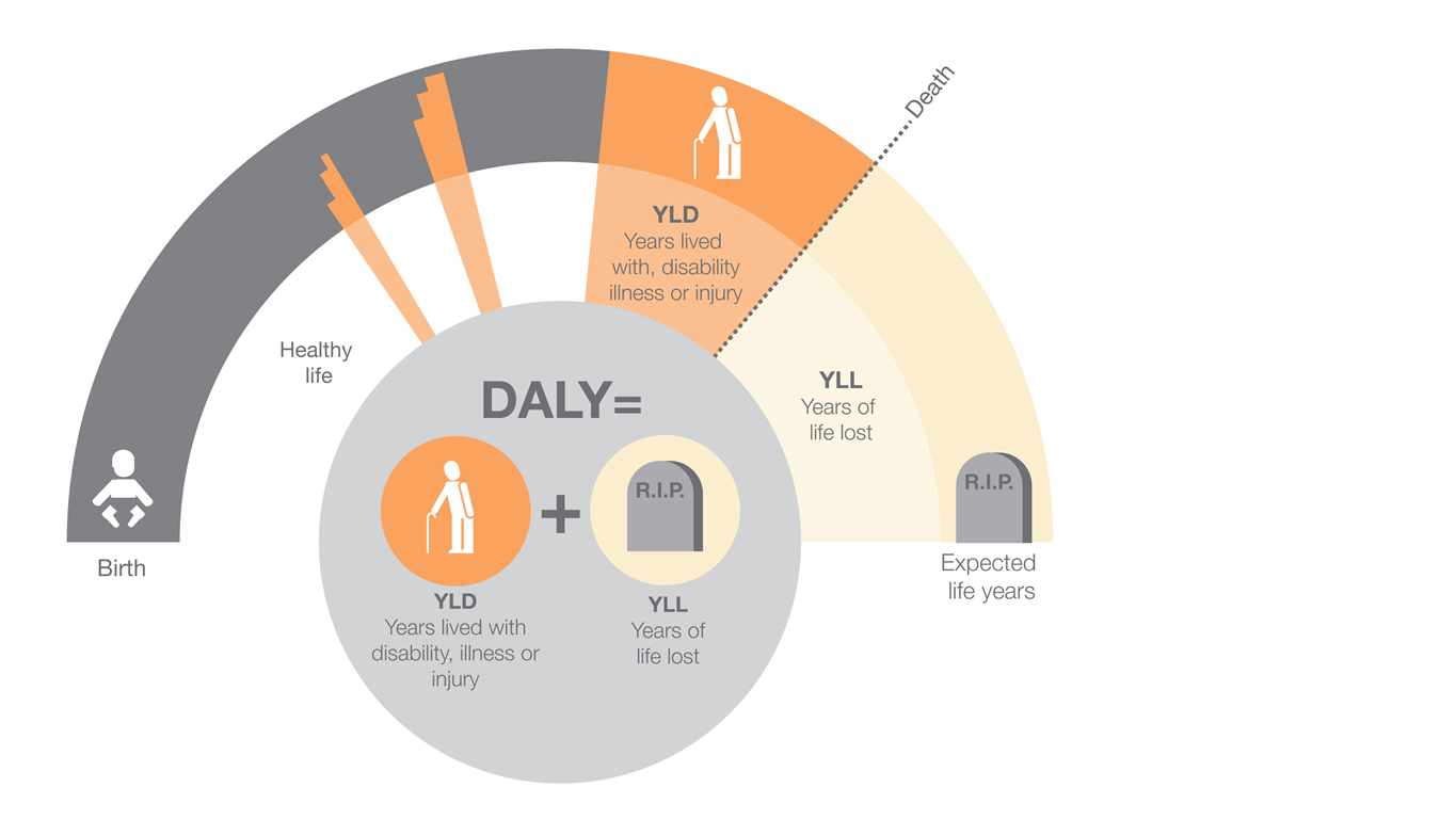
It’s particularly important that users are familiar with DALYs as this metric is an integral part of the wider Global Burden of Disease project. DALY is a measure of the overall burden of disease - it adds the years of life lost due early death, and years spent living with disability or ill-health, together.
Is it easy to share data/charts with others?
You can share data in a number of ways. Firstly, a hyperlink can be generated so you can send a particular screen of data to colleagues. Secondly, the tool will create image files of the charts you have generated. Finally, users of the system will be able to download aggregate data from the tool, and we hope to make this functionality available in the very near future.
How do users compare and view the data using the tool?
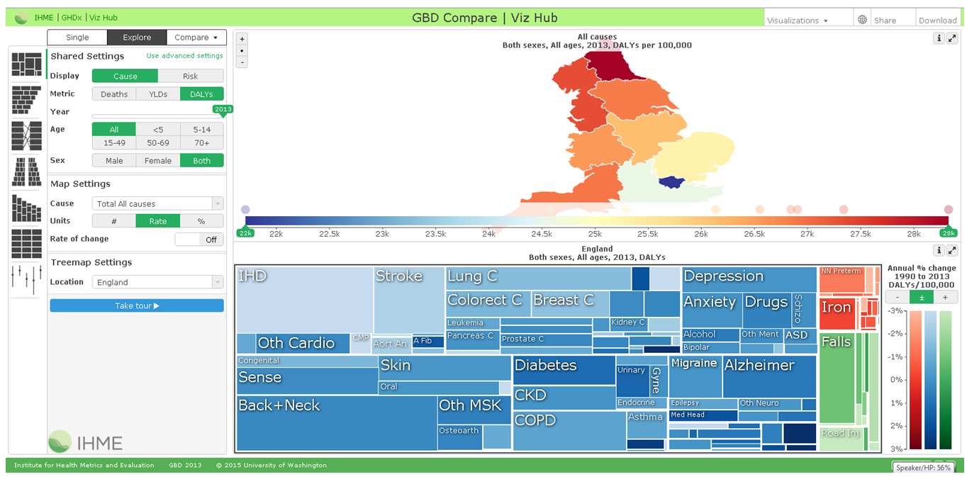
Once you’ve accessed the tool, your screen is split into a control panel (which helps you select the data you need to see) and a figure panel (where charts and data are displayed)
The control panel has three categories of controls, highlighted in the graphic below:
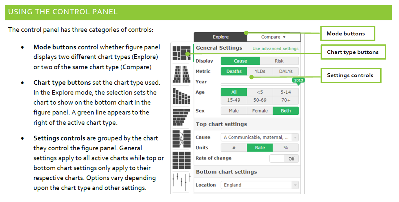
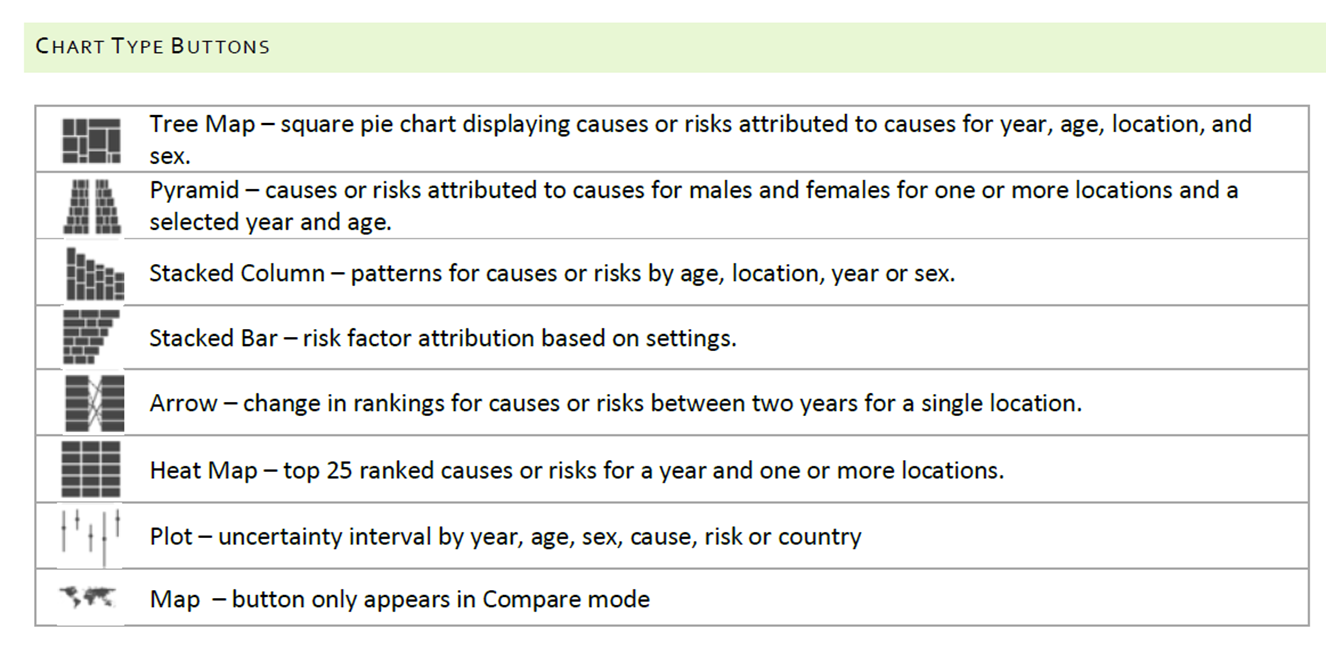
A range of different charts are available using the ‘Chart type buttons’ mentioned in the graphic above:
How are charts created? (Please view this information whilst using the tool)
Charts in the figure panel (right hand side of the screen) respond to:
- The settings from the control panel to the left of your screen
- Controls in the charts
- Clicking or hovering in the chart
In Explore mode, each bottom chart (the lower chart at the bottom of the screen) will also add or remove locations clicked on the map. Clicking on a cause in the tree map will change the cause setting for the map.
Maps: For each region displayed in the map, there is a corresponding circle along the top of the map legend displayed at the bottom of the map, this is the density plot.
- Hovering over the circle in the density plot will display the region’s name and data.
- Clicking on the circle will highlight the region on the map with a black outline. The circle will similarly be highlighted. Clicking again will remove the highlight.
- Clicking on the region in the map will highlight the corresponding circle in the density plot.
When using the legend, sliding the green markers on the axis will reduce or expand the range of data displayed in the map. When using advanced settings, the colour scale can be narrowed or expanded by moving the sliders and then clicking the Set Scale button. Reset the scale, by sliding the markers back to their original positions at either end of the legend and clicking Set Scale.
- Tree map: By default all cause proportions will display with colour in the tree map. Filter the tree map by growth or decline from 1990 by clicking the + and – buttons above the legend. When using advanced settings an additional filtering option to colour only statistically significant growth or decline is available.
- Pyramid: By default the chart will show all causes or risks for the selected locations. To select which causes or risks are displayed, use the drop downs that appear at the top of the legend.
- Stacked column: Select x-axis dimension using the x-axis buttons on the bottom of the chart. The x-axis buttons are also available on the plot charts. Legend functionality is also available.
- Stacked bar: By default the chart will display the highest level of the risk hierarchy. Navigate deeper into the hierarchy by clicking the risks on the y-axis. Return to the previous level by clicking the Back button in the chart. Legend functionality is also available.
- Arrow diagram: The arrow diagram is controlled entirely from the control panel. Click on a cause/risk in the diagram to change the cause/risk displayed in the map. Click on a location in the diagram to highlight the location in the map.
- Heat map: By default the chart will sort on the location in the first column on the left. Change the sort by clicking on a different location label.
Your feedback
This is just one tool in the armoury of public health professionals, but we are keen to make it as useful and usable as it can be. We’d like to hear your feedback – email burdenofdisease@phe.gov.uk