
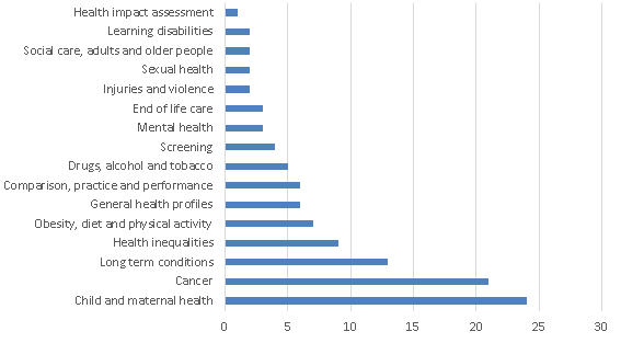
Public Health England was created from a large number of organisations and we inherited a lot of data tools and profiles, many of which are accessible via our data gateway. The number of resources by broad category is shown in the graph below.
(click on any image to enlarge)
From the gateway you can access cancer data via the Cancer Commissioning Toolkit, small area data through Local Health, and advanced spatial analytical tools through SHAPE.
With over 110 tools and data profiles available the challenge for us is to try and improve the accessibility of our data, rationalise the number of tools and make to them easier to use for our users and stakeholders.
We're trying to do this by consolidating our data, converging our technology and improving consistency in accordance with PHE's knowledge strategy.
Given that most of our outputs are web based we are developing a digital health intelligence programme (DHIP) to help us with this challenge. An example is the Fingertips Tool. This is a platform for managing indicators, creating profiles, and visualising data on the web.
It's used to create the public health outcome framework data tool, and the healthier lives application. It also underpins Health profiles, the mental health intelligence network tools, tobacco control profiles, the NCMP Data tool, NHS Health Check, National General Practice Profiles and the children and young people’s benchmarking tool among others.
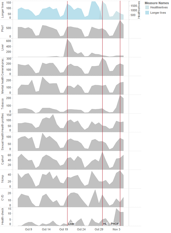
These tools are proving popular – daily web traffic (pageviews) over the last month across the tools is shown below.
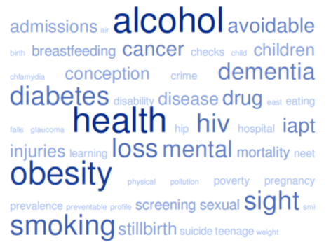
A feature of the Fingertips tool is that it allows users to enter a search term and it will automatically create a data profile and the word cloud below shows the top 50 search terms people have been looking for over the last 10 days. There have been more than 1000 searches.
The cloud shows the popularity of “alcohol” and “obesity” as search terms and that “dementia” is also popular. However there are currently very few indicators relating to dementia in the database. This kind of intelligence can guide us on how to populate the database and where indicator work is required.
Finally - moving away from PHE data tools - in case you haven’t seen it, this visualisation (displayed below) tracking the Ebola outbreak in West Africa is exemplary. Created by Ramon Martinez and updated weekly, it shows the geographical extent of the outbreak, cumulative counts by country and case fatality rates and can be “rolled back” to show how Ebola has unfolded.
Encouragingly, the latest data (as I write in mid-November) appears to show a reduction in the exponential rate of acquisition of new cases in both Liberia and Sierra Leone, and a reduction in case fatality.
2 comments
Comment by Andy Billett posted on
Very useful to understand the methods that are being used to evolve and develop the web-based data tools. And good to share the overarching knowledge strategy so that the bigger process is transparent. Because the tools are so widely used now, I believe timeliness of updates is becoming an issue and thought should be given to prioritising the update of some indicators over others. For example, winter flu immunisation uptake has not yet been updated to show the 13/14 uptake and we are now well into the 14/15 campaign.
Comment by Bren posted on
Hello Julian,
Thanks for a great blog and with lots of tools it is the ones that are most practical that will be needed.
I was not sure what the NCMP Data tool was about and wondered if it was worth expanding the acronym.
I think the digital health intelligence programme (DHIP) that you are developing will give you an insight into the areas covered/not covered and how to move forward. It was interesting to note that there are currently very few indicators relating to dementia in the database.
A great practical example of information and display of the Ebola and this was very hlpful to get an overview in quick time too.
Thanks Julian and a great blog.
Best wishes,
Bren.